Enhancements (PROG Wants Opinions- Please Comment and Vote)

#1
We are looking for comments on enhancing the appearance of the screen by adding additional color options and better font size control within the program.
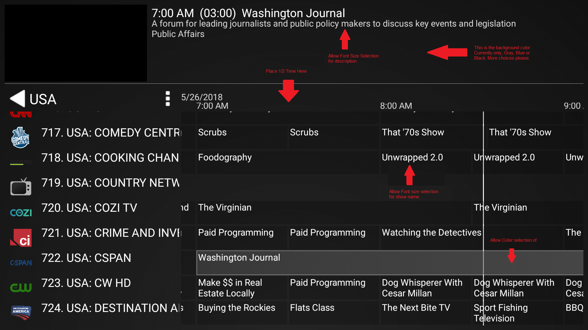
Take a look at the picture link attached.
1) In Guide with time line, show 1/2 hours (Example 2:30) across the top if the zoom is high enough to have room to display it.
2) Set Font size for text in guide timeline and description of listing at bottom or in top when on Timeline+TV
3) More color options other then Blue/Black/Gray
4) Be able to set color for Highlighted items
Image

Re: Enhancements (PROG Wants Opinions- Please Comment and Vote)

#8
You are correct, that when you specify a larger percentage for the font, all the text gets bigger. The problem is that if you set the percentage high enough for the description data to appear larger, the channel titles are TOO large. Here are 3 pictures set to 100%, 120% and 140%. The 140% makes the description data better, but the CHANNEL TITLES ARE TOO LARGE.

Picture Below fonts set to 100%
Image
Picture Below Font set to 120%
Image
Pictue Below Font set to 140%
Image
Thanks

Re: Enhancements (PROG Wants Opinions- Please Comment and Vote)

#10
The current problem is that if the Channel font is 20point ( 1 poiint is 1/72 of a inch) at 100% and the description font is 6 point, increasing by 140% will put the channel text at 28 point (which is very large) and the description will only go to 8.4 point.

If you do not want to set a seperate scaling factor for the description text, on option you have is to double the scaling factor selected for the description data. For example if select a scaling factor of 120% for the channel title, you could double the increase of 20 % to 40% for the description data and increase the factor to 140% for that text.

But the ideal solution would be to have seperate factors for the three area. 1) Channel Name and Show Name at top the way it works now. 2) Show Name in Guide and 3) description of show at top of guide

Re: Enhancements (PROG Wants Opinions- Please Comment and Vote)

#12
Frankboss wrote:
Mon May 28, 2018 7:05 pm
You are correct, that when you specify a larger percentage for the font, all the text gets bigger. The problem is that if you set the percentage high enough for the description data to appear larger, the channel titles are TOO large. Here are 3 pictures set to 100%, 120% and 140%. The 140% makes the description data better, but the CHANNEL TITLES ARE TOO LARGE.

Picture Below fonts set to 100%
- no tagged pics, PLEASE. Use links instead -://www.silvermountain.ca/pics/Screenshot_100%25.png[/img]

Picture Below Font set to 120%
- no tagged pics, PLEASE. Use links instead -://www.silvermountain.ca/pics/Screenshot_120%25.png[/img]

Pictue Below Font set to 140%
- no tagged pics, PLEASE. Use links instead -://www.silvermountain.ca/pics/Screenshot_140%25.png[/img]

Thanks
How did you get the UI to look like this? Beta builds or regular?