Page 1 of 1
New channel layout
Posted: Fri Aug 26, 2022 10:26 am
by noremorse
Hi,
The new layout no longer indents the channels within the current group - makes it hard to see. Can you add the indentation back please? (or make it an option at least)
Also, if I have sorted the channel list by name, and then I update the list from TV Sources, then if there is a new group it will always appear at the bottom of the channel list. Can you make it auto-sort the updated list to the same sort order it already had applied please?
Thanks.
Re: New channel layout
Posted: Fri Aug 26, 2022 10:42 am
by Prog
1. What you mean " indents the channels within the current group" ? Can you show on picture
2. No. That lost all user changes of list.
Re: New channel layout
Posted: Fri Aug 26, 2022 11:16 am
by noremorse
Re: New channel layout
Posted: Fri Aug 26, 2022 12:17 pm
by noremorse
Prog wrote: ↑Fri Aug 26, 2022 10:42 am
2. No. That lost all user changes of list.
Surely a developer of your great skills you could save the most recent sort order for each channel list/tv source, and when an update to that list is made then reapply automatically the sort? What do you think?
Re: New channel layout
Posted: Fri Aug 26, 2022 12:25 pm
by Prog
What problem on this picture?
Re: New channel layout
Posted: Fri Aug 26, 2022 12:33 pm
by noremorse
before this update it was like this (with channel name indented under the group name) and like this is easier to see
Re: New channel layout
Posted: Fri Aug 26, 2022 5:08 pm
by Prog
But why? That is lose a lot of screen space and not very informative.
Re: New channel layout
Posted: Fri Aug 26, 2022 6:46 pm
by noremorse
Its a treeview, and all treeviews indent when a node is opened. Why would you change that? Showing groups and channels in the same line is hard to see, the standard is that when a branch of a treewview is opened then the leaves are indented. Everything in Windows does that and so did ProgDVB until this latest version,. Why change it? Look this is the same with windows explorer - indented
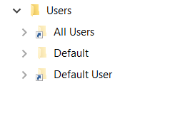
- x3.png (3.56 KiB) Viewed 19630 times
Re: New channel layout
Posted: Sat Aug 27, 2022 7:38 pm
by Prog
I am not like your idea (because lose of screen space) but I am collect feedback and possible do some settings in future version. New generation of OSD and channel list very flexy for settings.
Re: New channel layout
Posted: Sat Aug 27, 2022 8:58 pm
by noremorse
This is standard treeview layout and doesn't lose any screen space and you were already doing this until this most recent version.
Re: New channel layout
Posted: Sat Aug 27, 2022 9:03 pm
by noremorse
This is from v7.46.3, which I have reinstalled as it is better than 7.46.5 This layout is much better,
Re: New channel layout
Posted: Sun Aug 28, 2022 5:15 pm
by SkyBeam
Perhaps more regard the channel list as an accordion view rather than tree view.
Actually the group title "+" icon kind of indicates a tree so perhaps just showing a "down arrow" might be more suitable for the new view.
Moreover usually in accordion view the current view auto-collapses if another section is opened.
So while I agree that the new view is saving screen space (which I usually like) it's harder to find the group titles if multiple lists are in "expanded" state. So somehow the groups should be highlightes (e.g. by a colored background bar) or even by auto-collapsing non-active groups. At the moment it's very very hard to scroll through a large list finding the titles/groups if multiple groups are expanded.
So I generally like the idea to use collapsable lists but in current implementation it's not ideal from usability point of view.
Re: New channel layout
Posted: Sun Aug 28, 2022 5:57 pm
by Prog
Added some small interval but I am not like lose too much space
Re: New channel layout
Posted: Mon Aug 29, 2022 4:02 pm
by noremorse
The new version indent is very small. Can I request you add the size as a user-choice option in settings please?